In short
- The first screen should say what you do, for whom and where, and point to one main action.
- Trust is built by real photos, signed reviews published with the client's consent, and described case studies.
- A short form that says what happens next, and a tappable phone number, make it easier to enquire.
- Speed, a GDPR notice and measuring key events in GA4 are a foundation you cannot see at first glance.
- Most fixes can start with the headline, the phone number and the form, without building the website from scratch.
Table of contents (7)
A website that sells does not have to be flashy. It has to answer three questions for the visitor quickly: is this for me, can I trust them, and how do I get in touch. Below I describe the 12 elements whose absence I see most often when a business owner tells me that the website exists but the enquiries do not.
I have grouped the elements into four parts: first impression, trust, contact and technology. At the end there is a table that lets you assess your own website in a few minutes.
A website that sells starts with the first screen
A visitor decides very quickly whether to stay. The first screen should tell them what you do, for whom and where, and what to do next.
1. A clear headline: what, for whom, where
A headline like "Welcome to our website" says nothing. Better: "Accounting for small businesses in Szczecin" or "Air conditioning installation in homes and offices, West Pomerania". A person with a phone in their hand should know at a glance whether they have landed in the right place. The trade, the customer group and the area you work in are enough.
2. A visible phone number, tappable on a phone
In service businesses, many visitors arrive from a phone. The number should be at the top of the page and written as a link that starts a call when tapped. A number in plain text forces people to copy it, and many give up at that point.
3. One main call to action
If a website offers five equal buttons, the customer will pick none of them. Choose one main action, for example "Request a quote" or "Call", and repeat it consistently across the whole site. The other links can be less prominent.
4. Service subpages instead of a single list
A single "Services" page with a list looks tidy but answers specific needs badly. Someone searching for "sofa cleaning" wants to see a page about sofa cleaning, not a general list. A separate subpage for each important service lets you describe the scope, how the work goes and the area you cover. It also helps in search engines, because each service answers a different query.
From practice: When I ask an owner which service brings in their best jobs, it rarely has a subpage of its own. Most often it sits as a single line on a list.
Trust: why a client will believe you

The client does not know your company. Before they call, they look for proof that you are real and do your job well.
5. Real photos of the company and its people
Stock photos are spotted immediately. Show your team, your workplace, a van with your logo, the results of your jobs. They do not have to be polished, but they must be yours and well lit. A photo of the owner at work does better than smiling strangers at a desk.
6. Client reviews with a name or company
A review signed with a first and last name or a company name is more credible than an anonymous one. Publish it with the author's consent. You can also show Google reviews on your site, and I write about how to ask for them and how to reply to them in a separate post: Google reviews: how to ask and how to reply.
7. Case studies and examples
A short description of a job: what the problem was, what was done, what the result was. Before and after photos, if they suit your trade. Do not invent numbers. A true, concrete description is enough. If a client did not agree to being named, describe the situation without the name.
Contact: make it easy to enquire
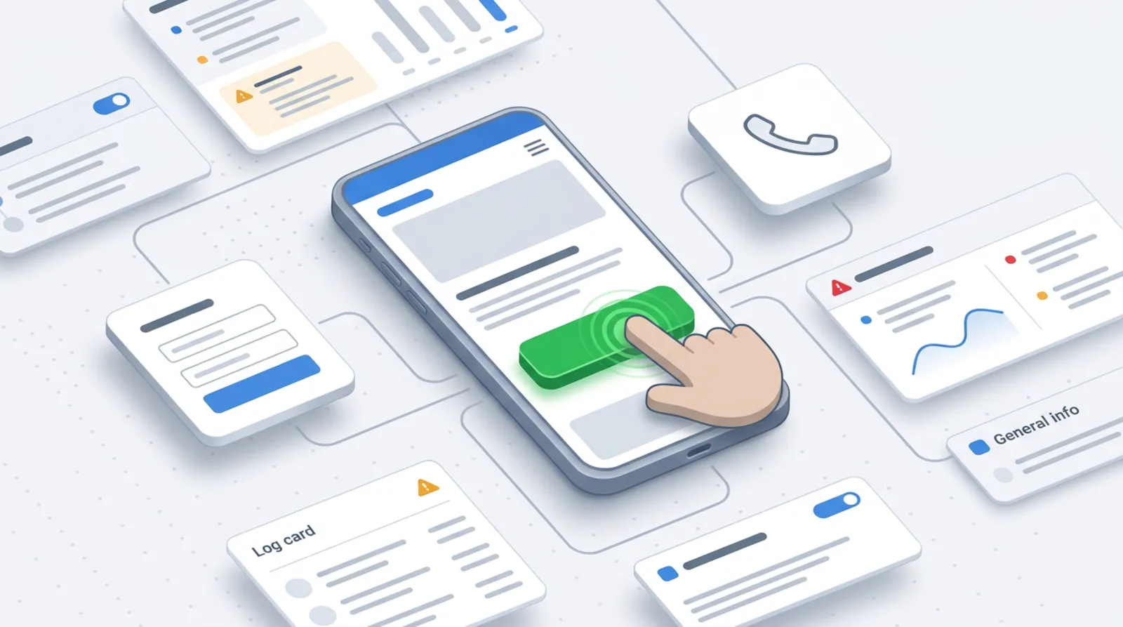
Even a determined client will be put off if contacting you is hard. This part of the website deserves the most attention.
8. A short form that says what happens next
Every additional field is another reason to give up. To start with, these are usually enough: name, phone or email, and a short description of the matter. Under the button, say what will happen after sending, for example: "I will reply within one working day". The promise has to be true. If you want enquiries to go straight into your system, see a form that creates a task in your CRM by itself.
9. Answers to common questions and price information
Clients are often afraid to ask about price, because they do not know whether it will be beyond them. If you do not publish a price list, at least write what the price depends on, or give a "from" range for a typical service. A questions section (lead time, payment method, area covered, warranty) answers doubts before the client raises them. I describe how to think about the cost of the website itself here: how much a website for a business costs.
Technology: speed, law and measurement
This part is the least visible, but missing it can cancel out everything else.
10. Speed and the mobile version
A website that loads slowly or "jumps" while loading wears visitors out. Google describes this under Core Web Vitals, that is, three measures: the loading time of the largest element (LCP), the response to a click (INP) and layout stability (CLS). The thresholds for a "good" result are given in the web.dev documentation. Check your website on your own phone, on an ordinary connection, not only on a computer in the office. The exact measured values depend on the website, so I do not promise any numbers without a test.
11. A privacy policy and a notice next to the form
If you collect personal data through a form, you must tell the person who the controller is and for what purpose their data is processed. This falls under GDPR, and the information can be placed directly next to the form. UODO (the Polish data protection authority) describes the rules for the information notice on its website. Settle the exact wording for your business with a lawyer or a data protection officer, because it depends on what you do with the data.
12. Measuring enquiries
Without measurement you do not know whether the website works. In Google Analytics 4 you can mark selected events, for example sending a form or clicking a phone number, as key events (in the Polish interface: zdarzenia kluczowe). Google's documentation explains that any collected event can be made a key event. This lets you see which sources the enquiries come from, not just the visits. Collecting such data requires lawful information about cookies and consent where it is required.
Table: assess your website in a few minutes
Open the website on your phone and go through the list in order. A "no" on any element is your first point to improve.
| Element | How to check in 1 minute | Yes / no |
|---|---|---|
| 1. Clear headline | Show the website to a friend for 5 seconds and ask what you do | |
| 2. Tappable phone number | Tap the number on a phone: does it start a call? | |
| 3. One main call to action | Is it immediately obvious which button is the most important? | |
| 4. Service subpages | Does every main service have its own address and description? | |
| 5. Real photos | Are there photos of your company and people on the website? | |
| 6. Signed reviews | Do the reviews have a first and last name or a company? | |
| 7. Case studies | Are there at least a few described jobs? | |
| 8. Short form | Does the form have a few fields and say what happens next? | |
| 9. Questions and prices | Can you find how pricing works, or a "from" price? | |
| 10. Speed | Does the website open smoothly on a phone without Wi-Fi? | |
| 11. GDPR | Is there a notice and a link to the privacy policy next to the form? | |
| 12. Measurement | Do you see submitted forms as key events in GA4? |
From practice: It usually turns out that three or four things are missing, and simple ones. Changing the whole website is rarely needed.
Where to start this week
Do not fix everything at once. Start with the elements you can change in a single day: the headline, a tappable number, one main call to action and the notice next to the form. In the next step, add subpages for your most important services, add reviews and describe a few jobs. Finally, set up measurement of enquiries, so you can check what actually brings contact.
If the website needs a bigger rebuild, for example faster performance or custom features, see my offer of web applications and websites. If you would rather I looked at your website from the point of view of enquiries, write to me through the contact form.
Frequently asked questions
How many fields should a contact form have?
As many as you need to call back and understand the matter. Name, phone or email and a short description are usually enough. Every further field increases the risk that someone gives up. You can collect additional information in the conversation.
Do I have to publish prices on my website?
You do not have to publish a full price list. It is worth writing what the price depends on, or giving a "from" price for a typical service. The client will judge more quickly whether the offer is for them, and you will get fewer random enquiries.
How do I know the website collects enquiries and not just visits?
You have to measure it. In Google Analytics 4, mark sending the form and clicking the phone number as key events. Then you will see how many enquiries came in and from which source, not just the number of visits.
Can I put client reviews on my website without asking for consent?
A review with a first and last name or a company name is best published with the author's consent. Google reviews are simpler to show, but make sure the client knows you are using them. If in doubt, consult a lawyer.
Sources

Author
Piotr Babczyński
I help businesses win customers online: SEO, Google and Meta ads, automation and AI. I work from Szczecin, Poland, and remotely. I write about what I test on real projects.
- 30 years in IT
- SEO and Google Ads
- AI implementation
- #website
- #enquiries
- #checklist